How to choose a font for your brand
Choosing a typeface for your brand can be a tricky business. There are thousands to pick from, some free and some expensive and it can seem a little overwhelming but it’s worth spending time making the right choice as it will help define your brand and bring your website and brand assets to life.
Typefaces have personalities, just like your brand, so choose a font that complements your brand's characteristics. It’s also important to align the typeface with your target audience, make sure it appeals to them and gives off the right signals. So where to start?
Research
Get to know the different classifications of typefaces such as serif, sans serif, script and decorative/display fonts. Each style has different characteristics and gives off a different impression to the reader. Here is a general overview:
Serif typefaces
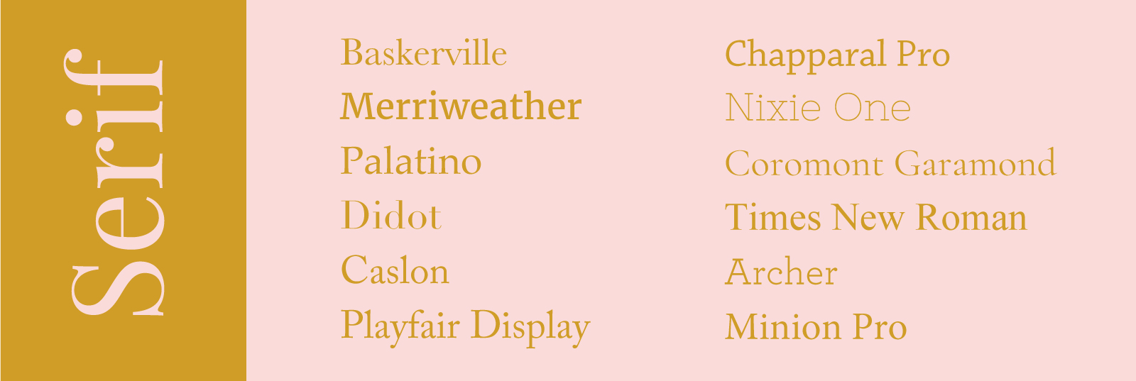
Defined by a 'serif' which is a small finishing detail at the start and end of strokes that create the letter forms. Serifs can take on different shapes such as slab and hairline and there are many subcategories within the serif classification including Humanist, Old Style, Transitional, Slab and Modern. Serif typefaces were the first letterforms recorded and as a result can express a classical, formal feeling. You're more likely to find the lengthy text in a book set in a serif font than a sans serif as in many studies the former was regarded as easier to read than sans serif fonts (however this is now widely disputed). Examples of well known serif typefaces include Baskerville, New Times Roman, Palatino, Didot and Caslon.
Sans serif
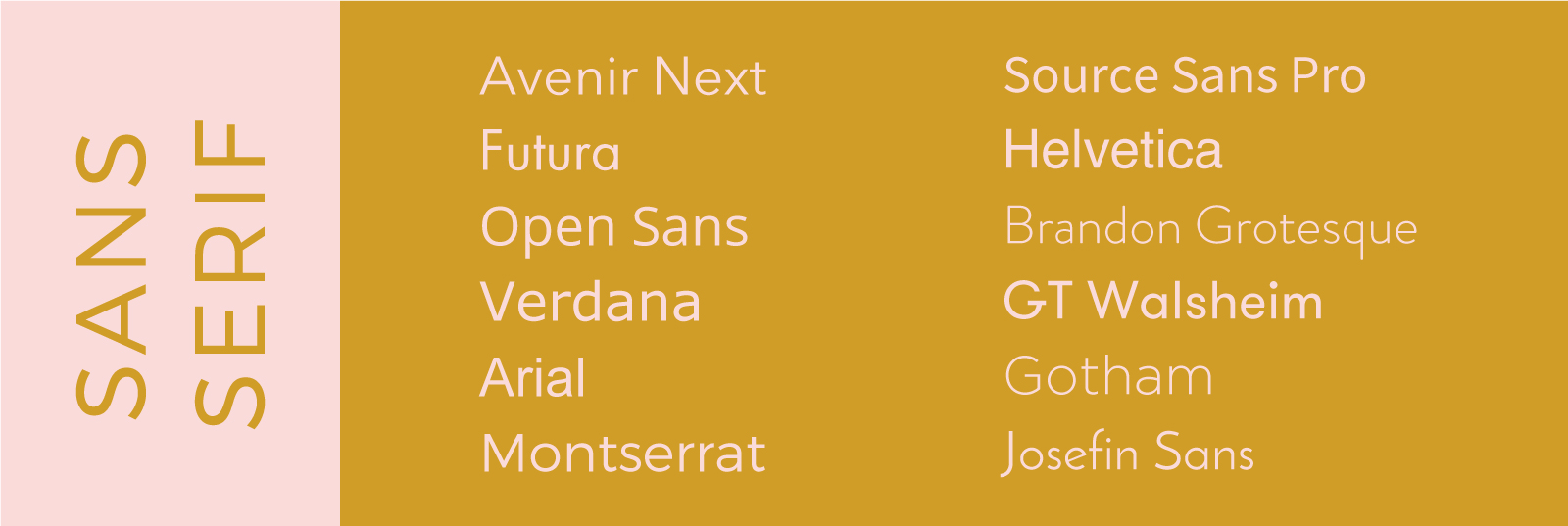
Defined by the absence of a serif and more of a uniform thick-to-thin stroke contrast within the letter form. Subcategories include Grotesque, Geometric, Humanist and Transitional. The first sans serif fonts appeared much later than serif fonts and therefore are regarded as contemporary in comparison and can convey simplicity and modernity or minimalism. Examples of sans serif typefaces include Helvetica, Akzidenz Grotesque, Verdana, Futura, Avenir and Arial.
Script
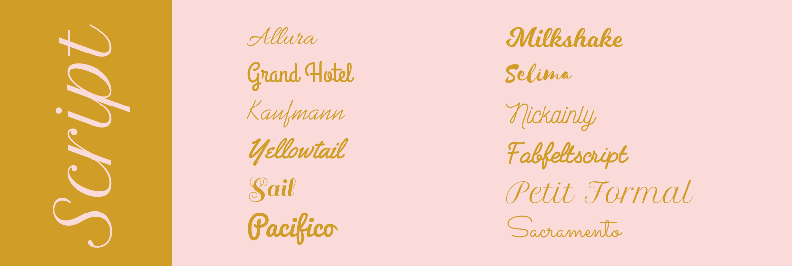
Based upon the characteristics of handwriting. They have a varied and often fluid stroke to the letter formation and can be broadly grouped in to 'formal' and 'casual' types. Formal scripts have routes in 17th century traditional calligraphy giving them elegance and grace whereas casual scripts are very informal, handwritten style. The latter has gained considerable popularity in the last few years, especially brush script and are often favoured by fashion, beauty and lifestyle bloggers due to it's feminine and pretty appeal. Creative Market is full of expressive casual scripts that are reasonably priced and easy to download. Script fonts are highly expressive and add a personal touch to a design, perfect for short extracts of text and offers lovely contrast to more neutral typefaces. However use sparingly!
Decorative/Display
Popular for signage and headlines and meant to decorate a design by evoking a particular feeling or aesthetic rather than for setting large blocks of text. Decorative fonts can create a strong typographic statement often reflecting aspects of culture such as graffiti. Grunge designs by David Carson popular in the 1990s are well known example of a decorative font style. However due to their distinctive appearance and reflection of the current time they fall out of fashion quickly and can easily look dated. For the purpose of choosing long lasting font styles for your brand I would avoid these classifications of typefaces unless it's completely integral to the brand's message, or just use only as supportive text to add texture to a design.
Have a look at websites that you like
Typography websites such as Typewolf has an amazing resource of font styles and pairings, I would highly recommend spending half a day looking at the different examples of website design and font designs. Draw up a short list of preferred choices and screen shot the examples. Similarly, any time you come across a website that has great typography, right click and inspect element to identify the font family. Learn to describe the font - what adjectives does it bring to mind and does this fit with your brand or brand's audience?
Free or purchased fonts?
Goolge fonts are great, there is a wide selection of all classifications readily available to download for free and use immediately. However that can also be the problem. The most popular Google fonts such as Open Sans, Montserrat and Playfair Display are widespread and, as a result, innocuous.
Therefore there is a very good argument for investing in a distinctive premium typeface for your brand. Having to pay for something, by definition makes it more exclusive and unique. We're not talking thousands, you can often invest less than a few hundred pounds and achieve amazing results so if you do have the budget I would argue it is certainly money well spent.
There are thousands of amazing typefaces out there so rather than following the crowd, it pays to dig a little deeper in your font selection and give your brand the voice it deserves.


